Product Designer
Project Lead
Optum / UHG
Timeline
Jun 2025 - Sep 2025
Product Owners
Engineering Team
Healthcare
B2B
Internal Platform
SaaS
Product Search
Filtering
Cloud
Due to NDA restrictions, some details, visuals, and illustrations have been anonymized.
The Problem
Product discovery in the Console catalog didn’t scale with cloud migration needs, forcing users to rely on documentation to understand which products could support their work.
What I did
Defined and validated a cloud-first discovery model for the product catalog, aligning layout, filtering, and visual indicators to real user workflows through usability testing.
Impact
Delivered a filtering system rated 4.3/5 for usability
Improved cloud product discoverability for 69% of users who rely on the catalog
Enabled faster product discovery and clearer cloud adoption paths
The Console Product Catalog is a core experience within a large engineering platform, used by teams to discover, manage, and adopt internal products and services.
I led a redesign focused on improving product discovery, with a specific emphasis on helping users identify cloud-enabled products during a broader cloud migration initiative.
Products were displayed in a static 3-column list with limited context
Users couldn’t easily identify cloud-enabled products
Cloud Service Provider (CSP) information required digging into documentation
No filtering existed to help users narrow results
Critical cloud data lived outside the catalog experience
This made product discovery slow and frustrating, especially for users navigating cloud migration.
The old layout of the Console product catalog
I led the UX work end-to-end, including:
Auditing the existing catalog experience and exploring layout and filtering patterns
Discovery work for cloud terms, categories, and data mapping
Designing and prototyping multiple catalog concepts
Running an unmoderated usability study
Leading enterprise-wide demos and aligning PMs, engineers, and product partners
Preparing detailed designs and interaction specs for development
Explored catalog layouts informed by internal patterns and external tech platforms
Early draft design wireframe ideas
Proposed an ecosystem vision with consistent cloud indicators to improve scannability and understanding

A visual flow of a future ideal state for the whole ecosystem
Designed flexible filtering, prioritizing Cloud Service Provider (AWS, Azure, GCP)
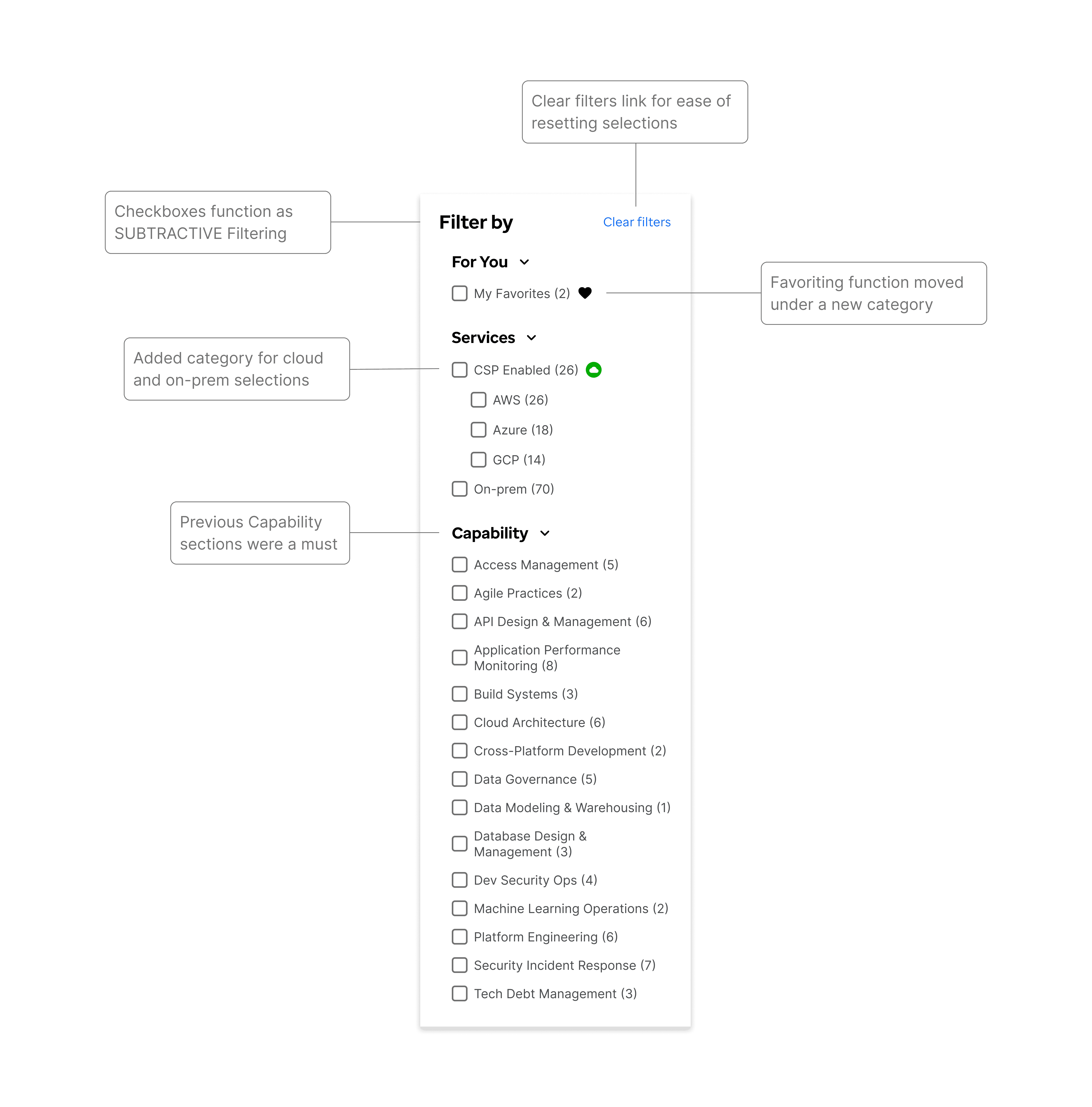
The checkbox filtering section of the catalog
Validated design decisions through usability testing and A/B comparisons
13 of the 73 users I messaged completed a detailed unmoderated study through MUIQ:
85% of users visit the Console daily
69% rely on the catalog to find products
Checkbox-based filtering rated 4.3/5 for ease of use
69% of users found CSP filtering as the most valuable cloud category
Users consistently preferred the 3-column layout
Product logos significantly improved recognition and scanning

A/B test examples during usability testing
User reflections:
"I like these proposed changes. I especially like being able to filter based on CSP type, as I use GCP for my application and usually have to use other services (like databases) that are hosted on GCP."
"I like the direction we are headed. As long as it is very performant then it will be a big success. Ensure that your tech capability domains stay aligned with the tech domains website"
"The checkbox filtering is very user-friendly. It's easy to search and select the functionalities I need."
"It was really nice and smooth and easy to get things."
The final catalog:
Makes cloud-enabled products immediately visible
Allows users to quickly filter by CSP and key categories
Scales as new products and attributes are added
Supports enterprise-wide cloud migration efforts
This redesign improved how users discover and adopt products across a highly complex, multi-product ecosystem
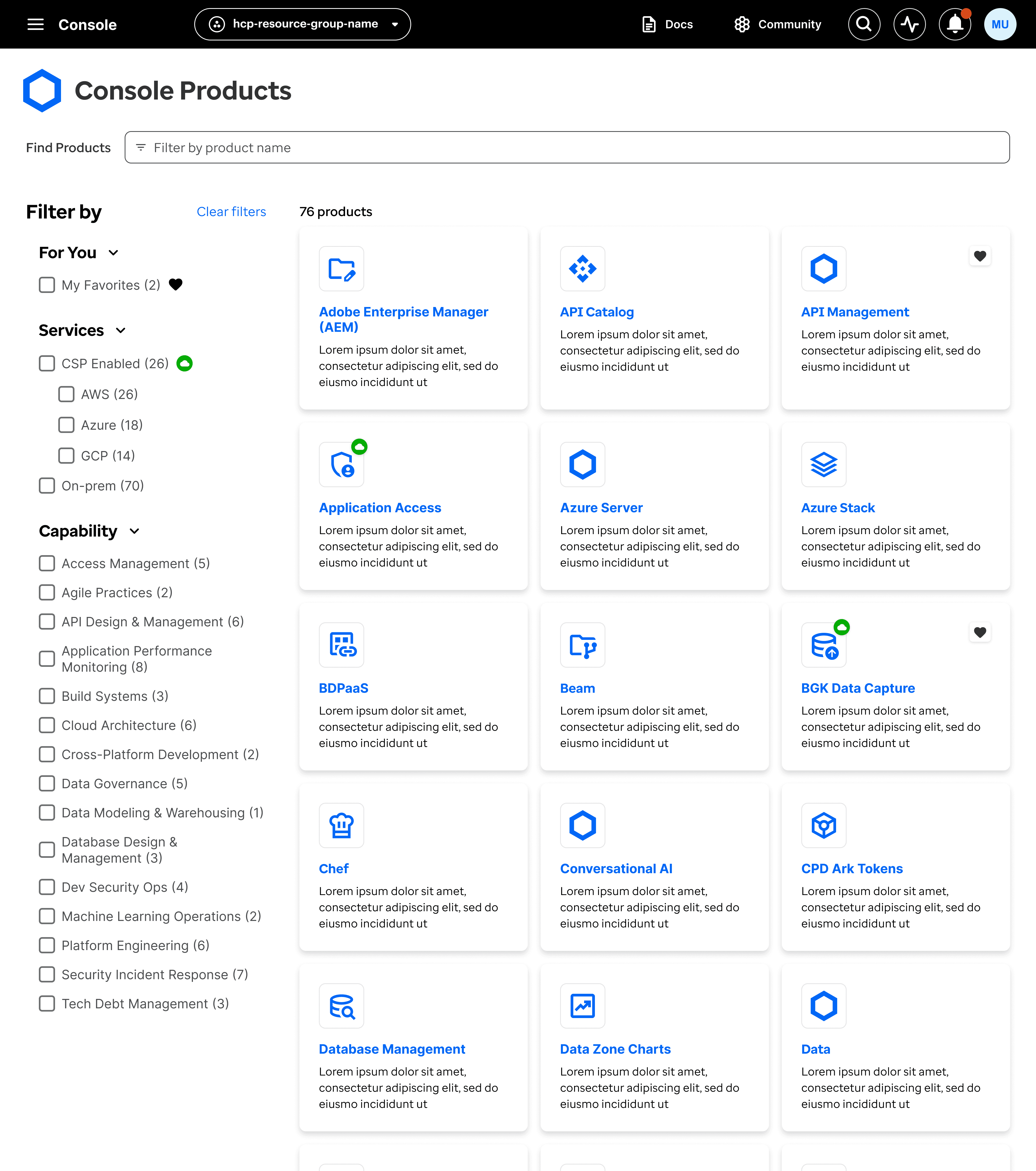
The final console product catalog design
Defining "Cloud"
Cloud information existed across scattered documentation and internal sources, with inconsistent terminology and levels of detail. I had to determine which cloud attributes were most meaningful for users without overwhelming the catalog experience:
Rather than exposing every cloud detail, I focused the MVP on Cloud Service Providers (AWS, Azure, GCP), a model validated through usability testing and scalable for future expansion.
Delivery priorities
My ecosystem vision to have cloud attribute icons recognizable throughout the whole ecosystem was well received by enterprise stakeholders, but large parts of it were out of scope for the main MVP:
I put other areas on hold that engineering was unable to get to, and focused on getting them the annotation details they needed for the primary product catalog
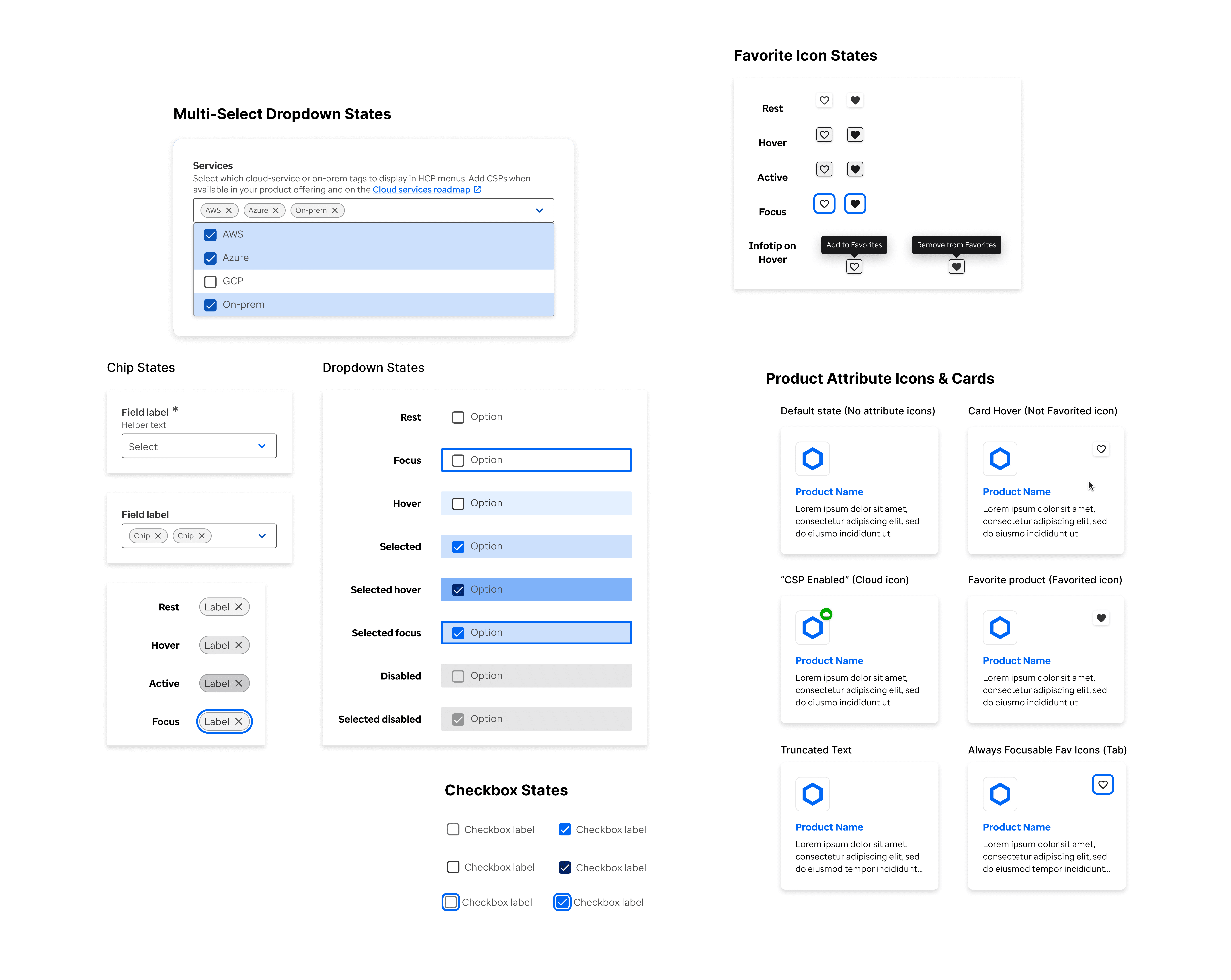
Styling details for various components