Product Designer
Project Lead
Optum / UHG
Timeline
Mar 2025 - Jul 2025
Product Owners
Content Writer
Visual Designer
Engineering Team
Healthcare
B2B
Internal Platform
Wayfinding
Visual Hierarchy
Navigation
Due to NDA restrictions, some details, visuals, and illustrations have been anonymized.
The Problem
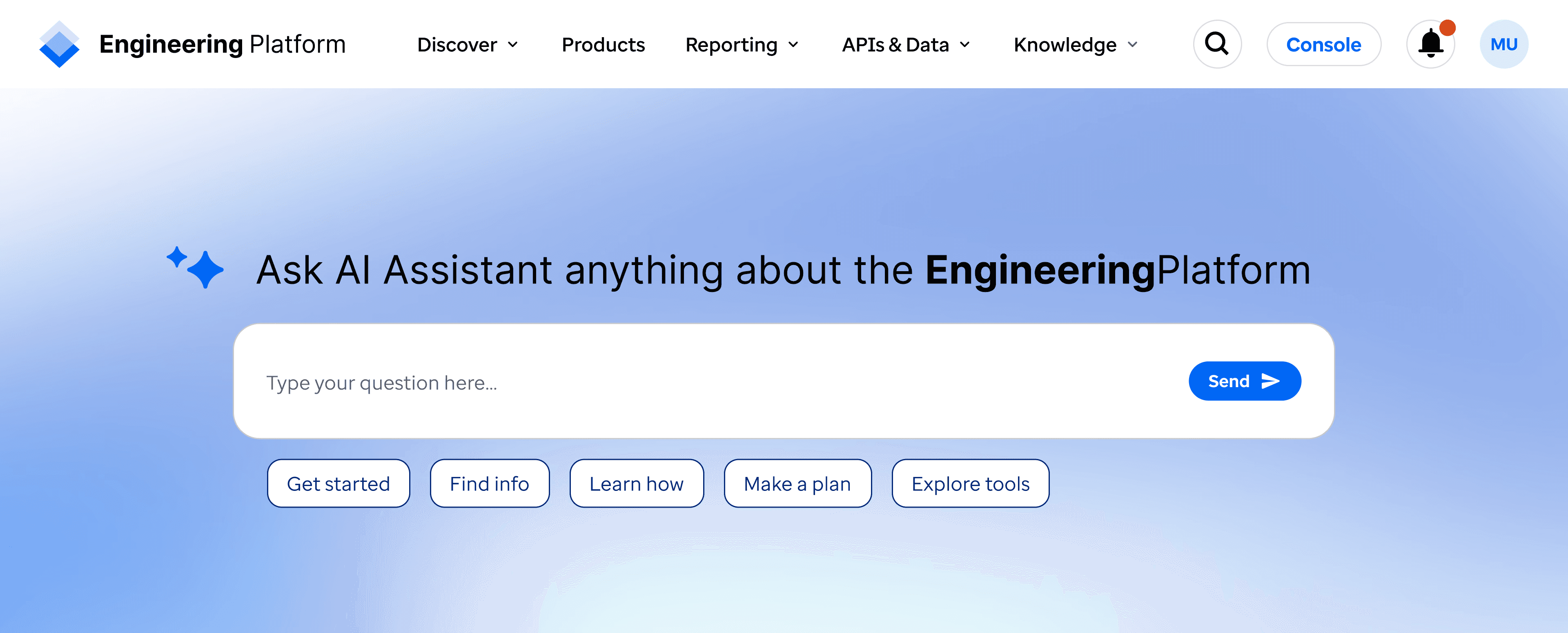
The homepage of a 20K+ MAU engineering platform was outdated, confusing, and misaligned with new cloud and AI initiatives.
What I did
Led a full homepage redesign re-establishing content hierarchy, clarifying value propositions, validating decisions through usability testing, and supporting both returning and exploratory users.
Impact
Positive usability and visual appeal feedback (80% favorable)
Clearer navigation and discovery for new and returning users
Homepage aligned to 2025 cloud migration and AI priorities
The Engineering Platform homepage is the primary entry point to a large internal ecosystem used by engineers, developers, and product teams across Optum and UnitedHealth Group. Serving more than 60K+ users annually.
It serves as a centralized hub for discovering engineering services, tools, AI assistance, documentation, and community resources, helping users navigate a complex, multi-product environment efficiently.
I led a redesign of this homepage to ensure it accurately represented the platform’s value, supported both returning and exploratory users, and aligned with evolving enterprise priorities.
This homepage is the primary entry point into the engineering ecosystem for up to 20K monthly users, but it no longer guided users effectively, led to confusion, and had become stale.
Homepage content was very outdated and not tied to any CMS
Content hierarchy misrepresented platform priorities
Multiple components didn't reflect their product effectively
Several sections were being decommissioned
New leadership initiatives (Cloud + AI) were not reflected
A content and hierarchy review of the old homepage
I owned the UX work end-to-end, including:
Partnering with PMs, engineers, and stakeholders, re-shaping the early feature and MVP scope
Auditing the existing homepage
Defining a new content hierarchy with a content strategist
Designing and iterating on all homepage components and navigation
Prototyping and usability testing
Delivering annotated designs for development
Re-established content hierarchy based on real user needs and platform priorities
New hierarchy notes and brainstorming prep
Designed low-fi modular components and assembled a cohesive long-scroll experience

Low fidelity draft homepage layout with notes

Full page draft to final design progression
Refined key sections (Community, AI Assistant, navigation) for clarity and usability

Draft to Final progression for key components
Validated decisions through an unmoderated usability study
15 total participants, all experienced platform users
70% regularly visit the homepage
67% preferred the final design options from an A/B component comparison
80% found the new design visually appealing
80% were either motivated to click a CTA, learn about new offerings, or use AI to explore
Majority of users rated the experience as clear and easy to use
User reflections:
"Cool tool! I just finished the study. I really like the redesign. The current homepage has too much text and visual at the top of the page, and too may different formats - I find myself not reading most of what's on the page and just going to search."
"I think that bringing the cloud migration and workload placement forward given it's the top technology initiative is smart. I will only scroll a page so far before I turn to search."
"I thought it was easy to navigate to catalog and chat, which are two of the ones I use most."
The final homepage:
Clearly communicates platform value
Improves navigation and content discovery
Aligns with cloud migration and AI initiatives
Scales more effectively with the broader ecosystem
This work helped modernize a critical entry point used by 20K+ monthly users.

The complete and final homepage design
Stakeholder alignment
Early requirements were vague and solely focused on content, but my team and I clearly articulated other key problem areas and I guided the way forward with early wireframes
Our PO pushed for a search-only homepage, but we validated that our users are already very aware of search and that new users will need clear guidance
Constraints
I only had access to existing users and only 26% of users I reached out to responded
Some UX animations were deprioritized by dev, but I ensured the main enhancements were in MVP
I focused on the main MVP items I proposed vs. perfection, and spoke into future iterations
Future thinking
I explored concepts for deeper AI integration into the top of the homepage & search, to inform future roadmap discussions, especially since feedback showed that experienced users often went right to search. This helped:
Guide PO search preferences to a solution based on user feedback and emerging technologies
Clearly guide long-term platform iterations and future roadmap
Potential future phase homepage iteration and exploration